The Thought Leaders Practice is the best business book I have read so far in 2019. This book lays out a solid method for thought leaders to build their business and scale up their revenue. This book is so rich in information and practical tactics, I’m glad I spent the time to dive deep into it.
I hosted a virtual Book Club for this book, so I could discuss it in detail with a few other entrepreneurs. Rather than tell you what I thought about the book, I’ll just share the notes I took every week on my Instagram account.
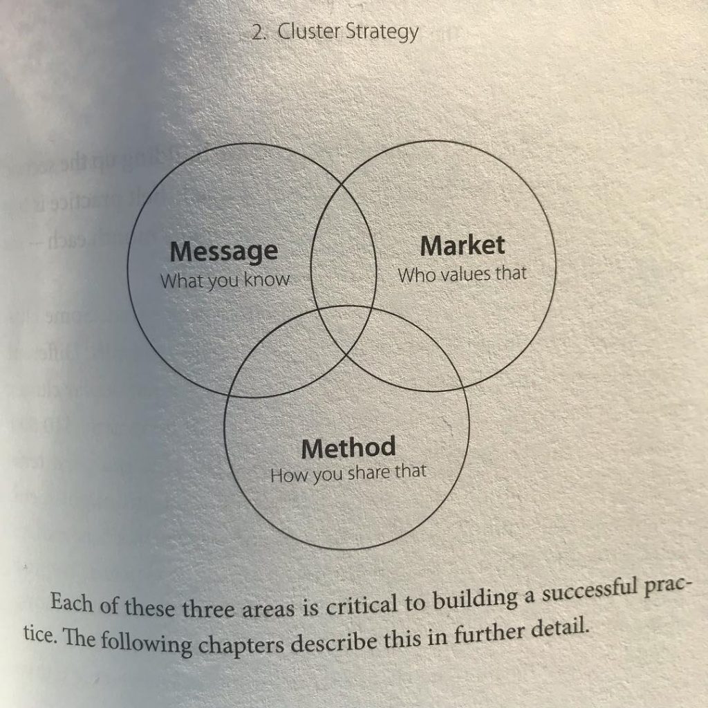
Week 1: Business Model
Opening questions:
1- When is a business better than a practice?
2- Out of the three, Message, Market, and Method, if you could only pick 2 to have solid, which would you pick as your weak leg?
3- If you built your practice so you had $5 million in 10 years, what would your life be like?
Key takeaways:
It’s a practice if you love doing it.
You need to enjoy interacting with your market. If you don’t like your audience, your passion won’t be there.
To find your message: What are you willing to rant about?
Live *into* it.
Week 2: Your Message
Opening questions:
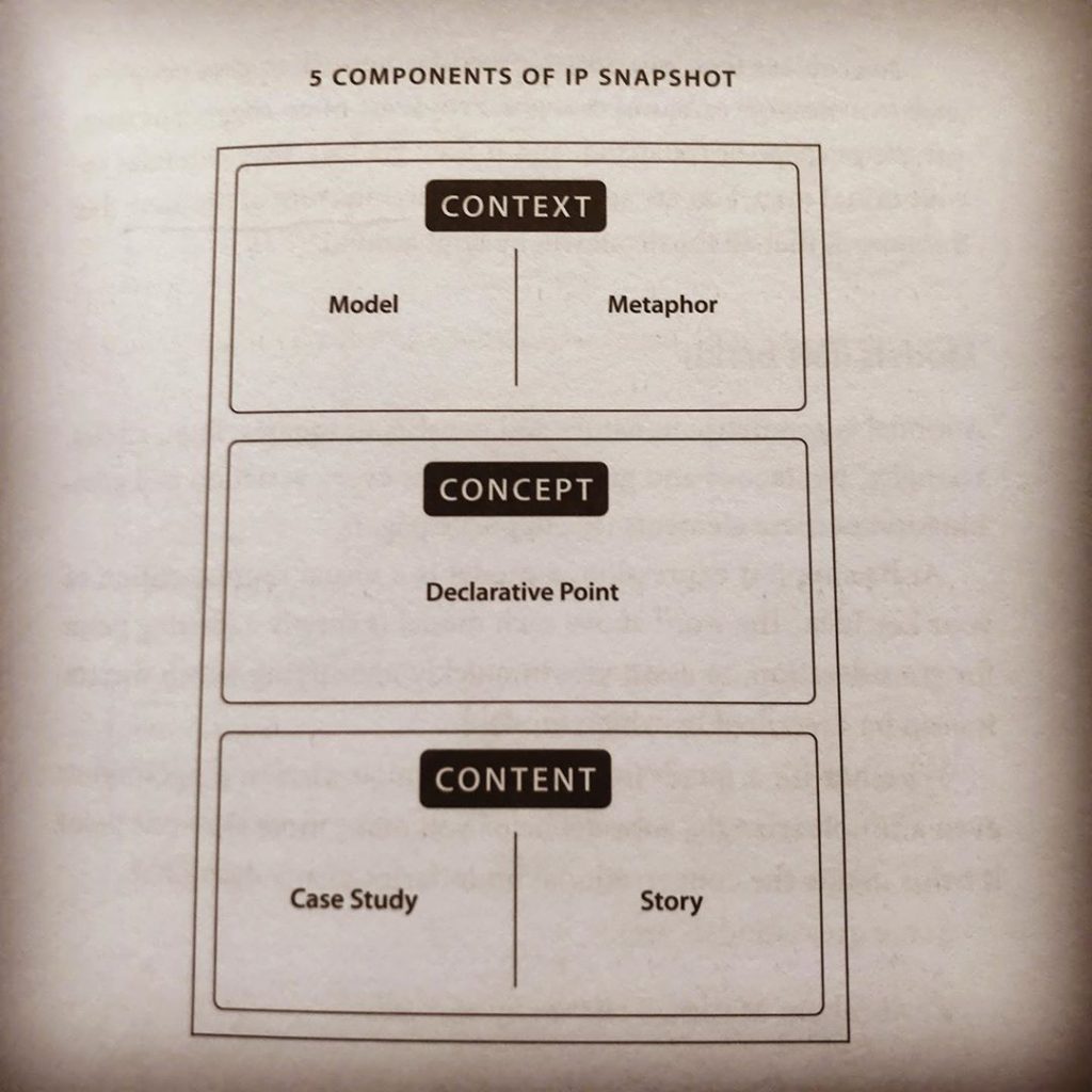
4- Full spectrum ideas are Relevant, Thorough, Elegant, and Unique. How can you tell the difference between these layers?
5- Can you test an IP Snapshot’s left-right balance?
6- How can you tell the difference between one idea and a group of related ideas?
Key takeaways:
On a smaller scale, an idea is just an opinion.
To test: Here’s my idea, can you repeat it back to me?
You don’t have to have more ideas, you just have to articulate yours better.
An idea is relevant to the market that will pay for it.
Week 3: Your Market
Opening questions:
7- How do you discover unknown, unspoken problems?
8- What is your invitation right now?
9- Do all starter sentences apply universally?
Key takeaways:
Unspoken problems are often fears.
First levels of problems aren’t the real problems.
Being human with someone online creates a huge amount of trust.
You can fish in the smaller pond or the bigger pond.
Thought leadership is portable.
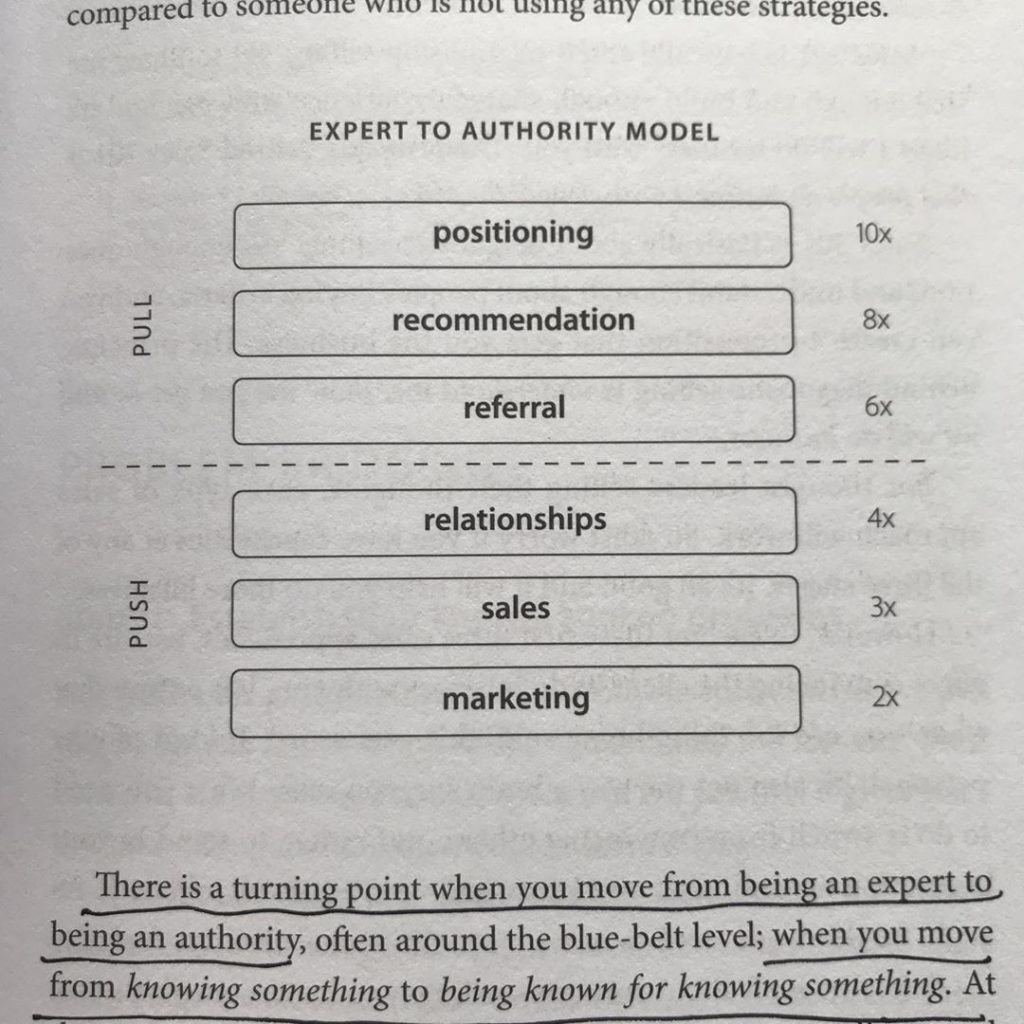
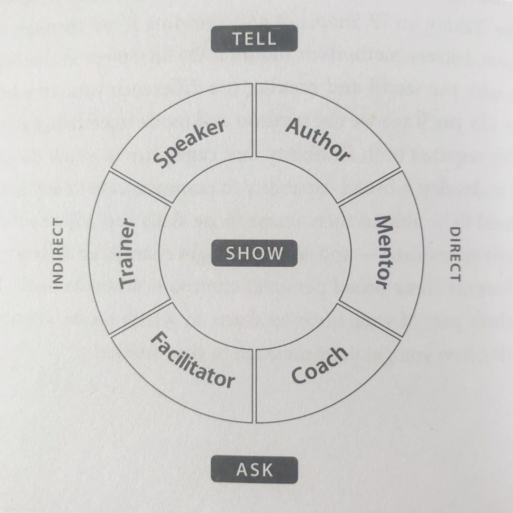
Week 4: Your Method
Opening questions:
10- Do any of the 6 modes *not* depend on results?
11- What happens if you choose 2 opposite modes?
12- What is your big word?
Key takeaways:
Impact is different than results.
Masterminding with your peers is facilitation, and with up-and-comers it’s mentoring.
A thought leader does not implement the solution, they stay in the realm of the problem.
Thought leaders empower the fixers but do not implement the solutions themselves.
Services are not thought leadership, but they are a common starting point for thought leaders to start from.
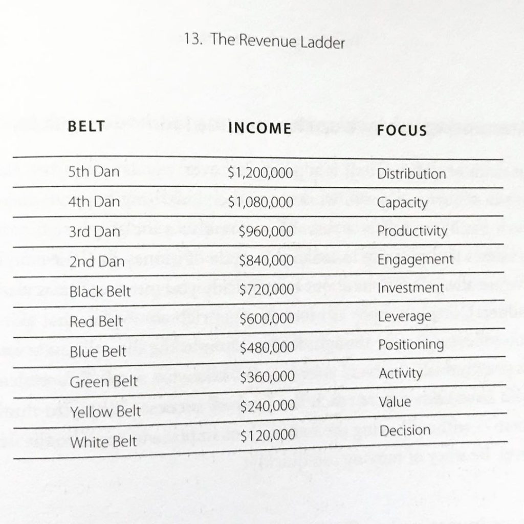
Week 5: Steps to Success
In the final session of the #thoughtleaderspractice book club we discussed Section 5: Steps to Success.
Opening questions:
13- What happens if you do the right things at the wrong time? Example: trying to have others sell your IP before you get to Red Belt.
14- Can you identify a cluster by finding a common tribe of 150 people in your network?
15- thinking of what you sell, what price sounds outrageous for you to charge right now?
Key takeaways:
The point of leverage is not what you provide, it’s who you provide it to.
Use the framework to get up the ladder, but be flexible on how you take the steps.
90 days is spent building a cluster, but selling & delivering is ongoing beyond that quarter.
Exclusivity can justify outrageous prices.
This was a great book club, and I really enjoyed it. Big thanks to Kathleen Celmins, Jonathan Logan, and Michael Riscica for talking with me every week for the first session.The second session of the Thought Leaders Practice Book Club was recorded here:
About The Author
Caelan Huntress is the father of 3 kids, and in his spare time serves as creative director of Stellar Platforms. He is also a writer, digital marketer, multimedia producer, and a retired superhero. He blogs about his adventures on https://caelanhuntress.com.
Attention is so scarce online, you only have a moment to convert. That’s why a good homepage CTA above-the-fold can be so powerful – in first moment that someone lands on your homepage, they should immediately know who you are, what problem you solve, and how you can help them solve it. This article has 10 homepage CTA examples that use their above-the-fold content in the right way.
What is ‘Above The Fold’ content?
The term ‘above the fold,’ according to Wikipedia, refers to ‘the portions of a webpage that are visible without further scrolling or clicking.’
If you remember reading that old media interface we used before the Internet – the newspaper – then you probably know intuitively what ‘above the fold’ means.
“Most newspapers were sold from sidewalk kiosks,” as they say on OptinMonster, “folded in half so passersby could see the top half of the front page. If what they saw didn’t grab them, they’d keep on walking, and sales would be down. That’s why it was crucial to put your best, most interesting content ‘above the fold’.”
And what is a CTA?
CTA = Call-to-Action. This is the message that incites your user to do something specific.
Here are 10 lessons from 10 great websites that use their above-the-fold section to frame their CTA really well:
Headline: My name is Susan Peirce Thompson, Ph.D., and I want to help you get Happy, Thin, and Free.
Susan has a program that helps you decide in the moment when you should or shouldn’t eat something, with clear, bright lines.
What I like so much about Susan’s messaging is its clarity. She has a very well-defined problem she solves, and you don’t have to spend any time figuring it out. If you are struggling with your weight, she speaks directly to your problems, and you know exactly what you need to do next (take the quiz!)
LESSON: Clearly articulate what you offer right away
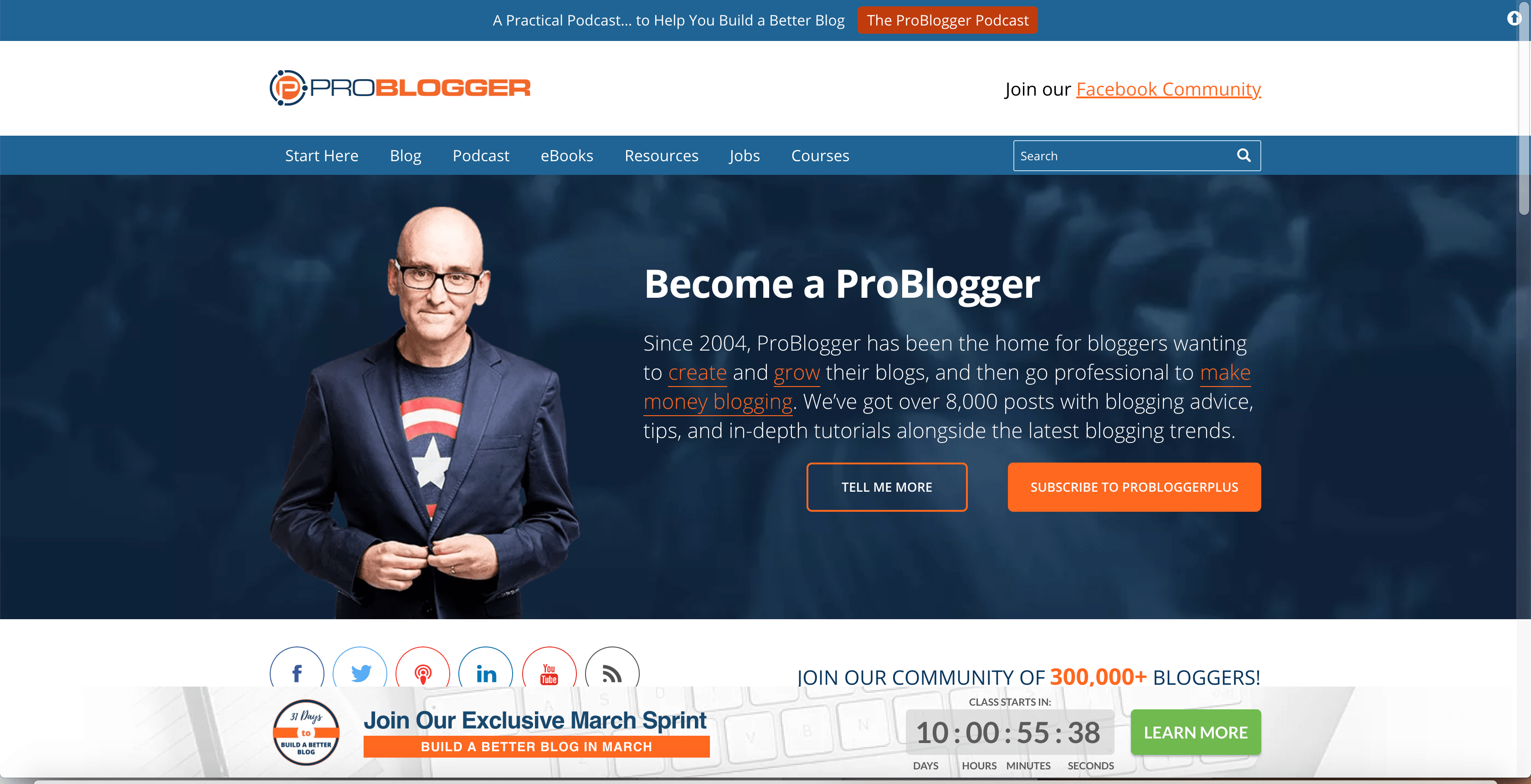
If you’re a blogger and you want to make a career out of it, you want to be a ProBlogger. Darren has been helping people level up their blogging game for a long time, and his advice is always friendly and helpful. (Read my review of Darren’s talk at WDS here.)
This homepage has lots of CTAs – join the Facebook community! Listen to the Podcast! Subscribe and Follow! Look at all these orange links! – but unlike most other target markets, this works for bloggers. We are a hyperactive bunch, and we know how to open links in new tabs, so I think he breaks the rule of ‘one CTA at a time’ very nicely here.
This blog is a vehicle to the podcast. Everything above the fold here is to convince you to get to the podcast – he’s got tons of social proof, the title of the latest episode (twice! In two different colors!) and any competing options are barely visible.
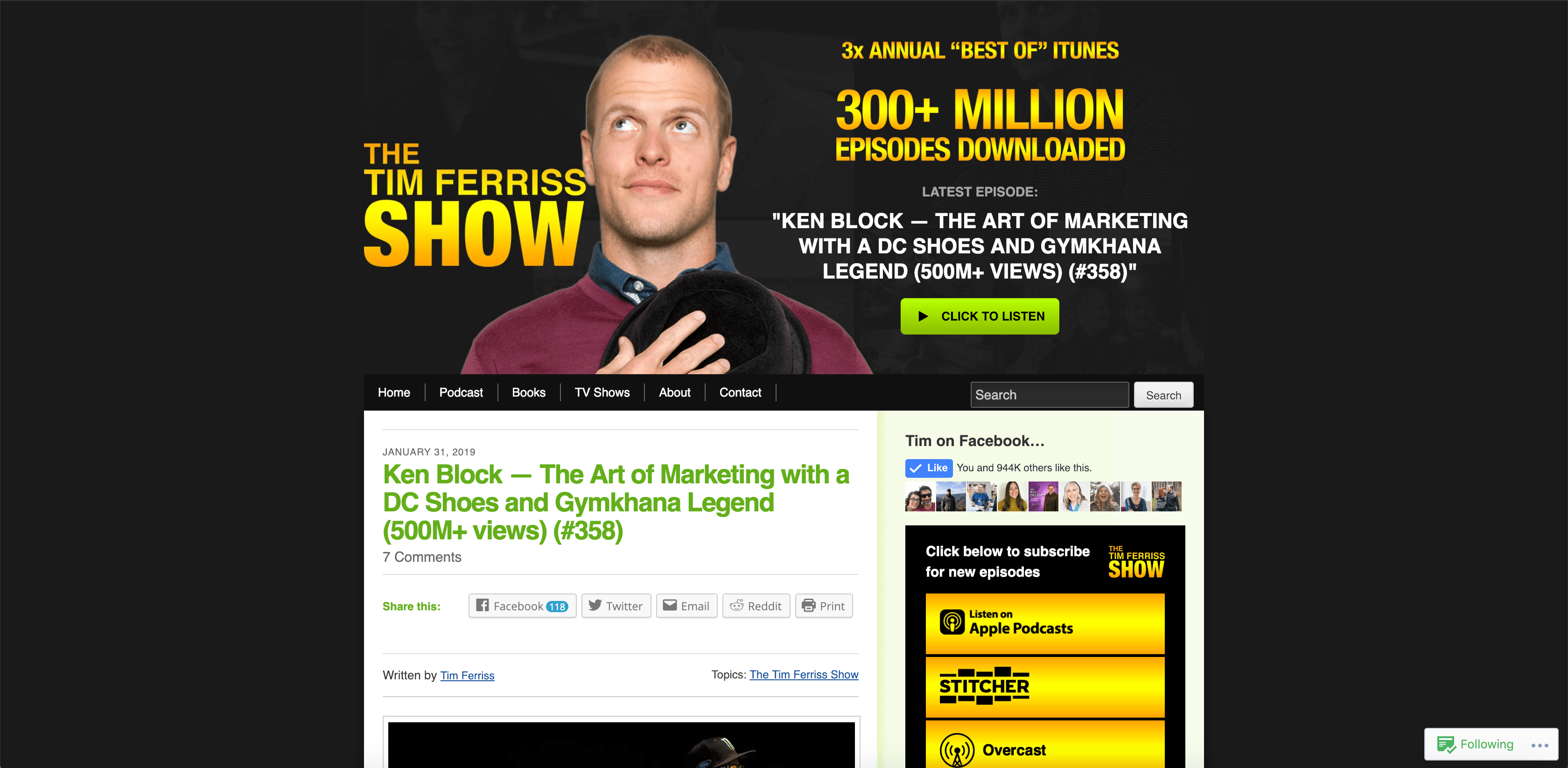
Tim Ferriss’ website does not exist to convince you why Tim is awesome – he’s beyond that point. Now he’s directing his audience to what he wants them to do next. He doesn’t want new website visitors to hire him for coaching (yet), or to approach him with VC deals (here), or to subscribe to his newsletter. All he wants is for you to listen to his podcast, because that is the strongest cornerstone of his platform, and the entry point to all his other offerings.
Lesson: Direct the top of your funnel to one destination
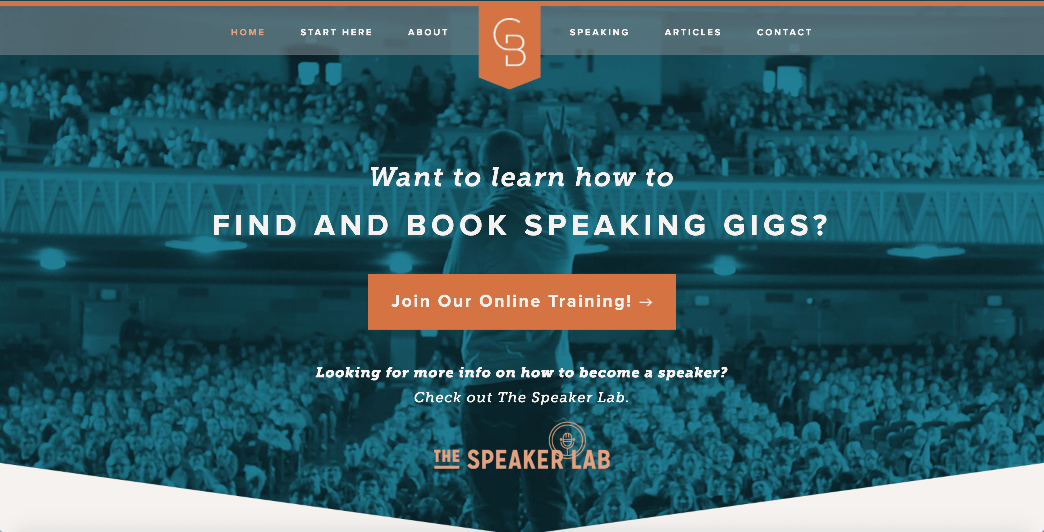
Headline: Want to Learn How to Find and Book Speaking Gigs?
Normally, your above-the-fold CTA should not lead to another website. When someone lands on your homepage, why would you want to immediately take them somewhere else? In Grant’s case, he’s got good reason. He has a very clearly defined Customer Avatar – public speakers who want to get booked and paid to speak. His signature course is promoted in his free course, which you find by clicking the ‘Join our Online Training’ button here.
This is a good looking homepage, and it validates Grant’s credentials and authority. If you happen to match his Customer Avatar, however, he wants to get you into his funnel right away, and his CTA button is a great way to do that.
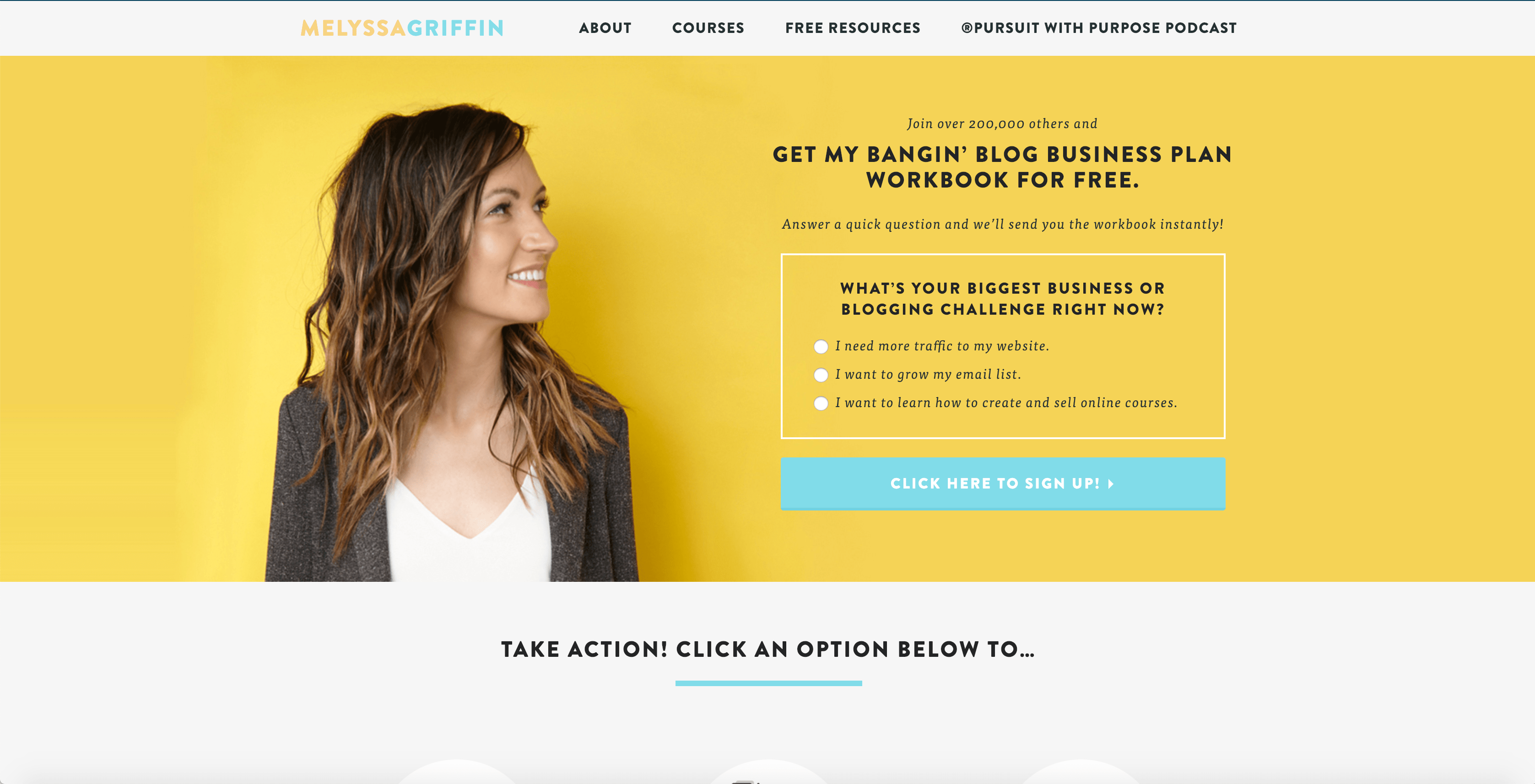
Headline: Get my bangin’ blog business plan workbook for free.
This homepage includes an extra feature, something I usually see just a step or two lower down in the sales funnel: segmentation! By selecting the group with which you most strongly identify, Melyssa is gearing up a different automation sequence for you after you subscribe. Normally this is done in a follow-up email (as I typically handle it in the Stellar Email Template) but here it works seamlessly as part of the sign-up process.
The design of this hero section is bold and minimalistic, which helps offset the large amount of text in the selection boxes. I especially like the various options she presents JUST below the fold, encouraging you to scroll a little further (and to self-segment yourself again).
LESSON: Segment your audience at all the natural decision points
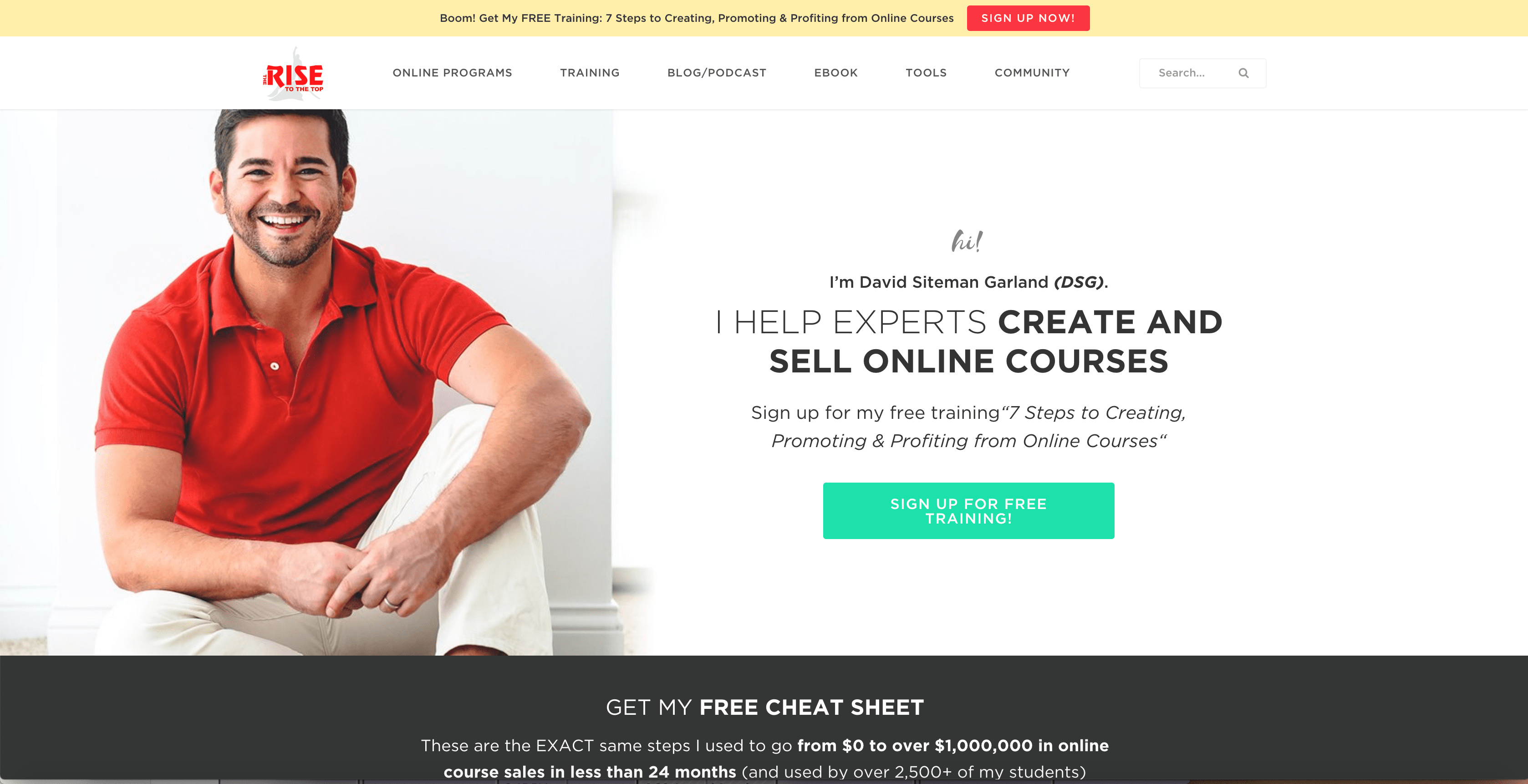
Headline: I help experts create and sell online courses
The hero shot here is really personable and engaging – I just wish it didn’t cut off his head! While I like the clarity and simplicity of his message – if you are an expert, and you create and sell online courses, you know that you want what he’s selling – I’m not a big fan of the color palette, and I think the ‘Get My Free Cheat Sheet’ CTA just above the fold is more compelling than the ‘Sign Up for Free Training’ in the green button.
What this homepage does really well is bolding out the big result his customer wants – CREATE AND SELL ONLINE COURSES – in a way that makes his Customer Avatar sure to dig deeper.
LESSON: Focus on the specific outcome your audience wants
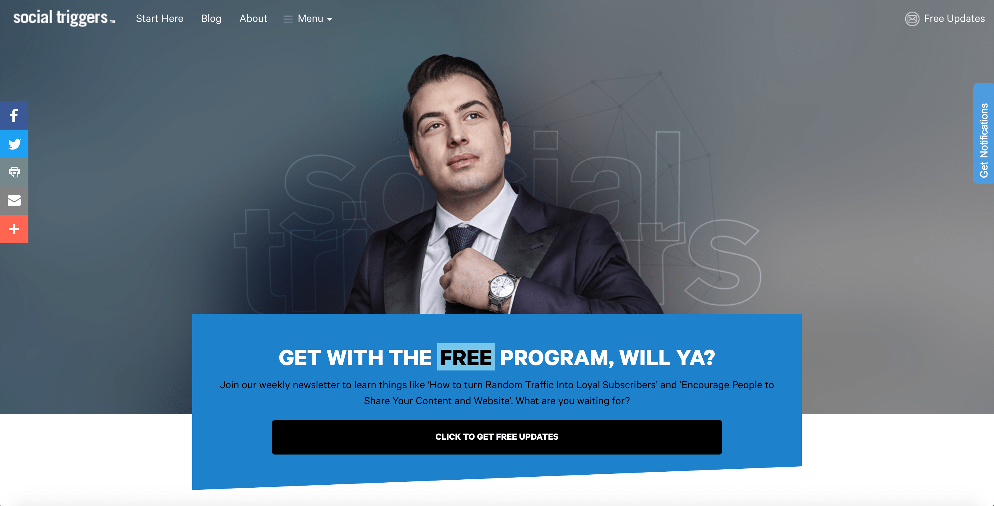
This is such a clear and simple homepage that it should be framed. The confidence in this hero shot – that is the confidence that Derek’s customers want to have. (Having your imagery visually convey the experience your customers hope to have is on the first page of the Stellar Homepage Checklist.)
While this could have been a very bland CTA – ‘join our weekly newsletter’ is in the start of the subhead – he’s put a very good set of copywriting twists on it that are intriguing, and make you want to learn more. It even says ‘free updates’ in the upper right, instead of ‘subscribe now,’ and that’s a good pivot. I also like how this homepage doesn’t celebrate the logo, but the logo’s typography still frames the visual experience. Instead of the logo being the champion of this website, it’s Derek himself, and that’s a much more authentic expression of a personality-based brand.
LESSON: Your homepage is about you, not just your business
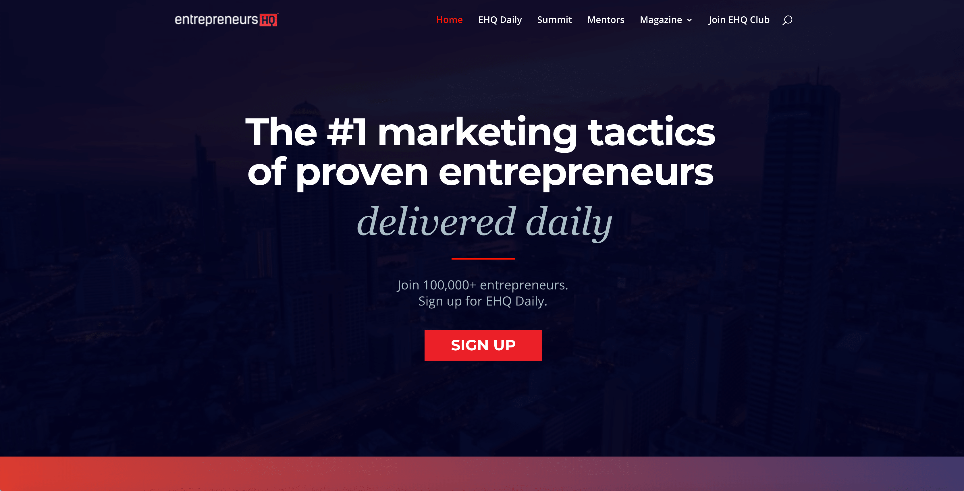
HEADLINE: The #1 marketing tactics of proven entrepreneurs – delivered daily
Normally I find ‘Sign Up’ to be a weak CTA in this day and age, but on this homepage it works. There isn’t a hero shot confusing you with the personality of the author – contradicting the previous lesson with Derek Halpern – instead, there is just a clear and simple value statement, and everything is framed around the daily email.
Putting so much effort into content marketing means that Liam does not want to dilute his main message (‘Sign Up’) with competing calls-to-action. He may have plenty of programs to sell, and media to review – videos, and podcasts, and ebooks, oh my! – but he will pitch you all those things in good time, AFTER you have subscribed. This homepage is a lot like a landing page – its goal is to convert you into taking ONE action, and other subsequent CTAs don’t distract you from taking this entry into the larger funnel.
LESSON: Optimise for the one action you want people to take
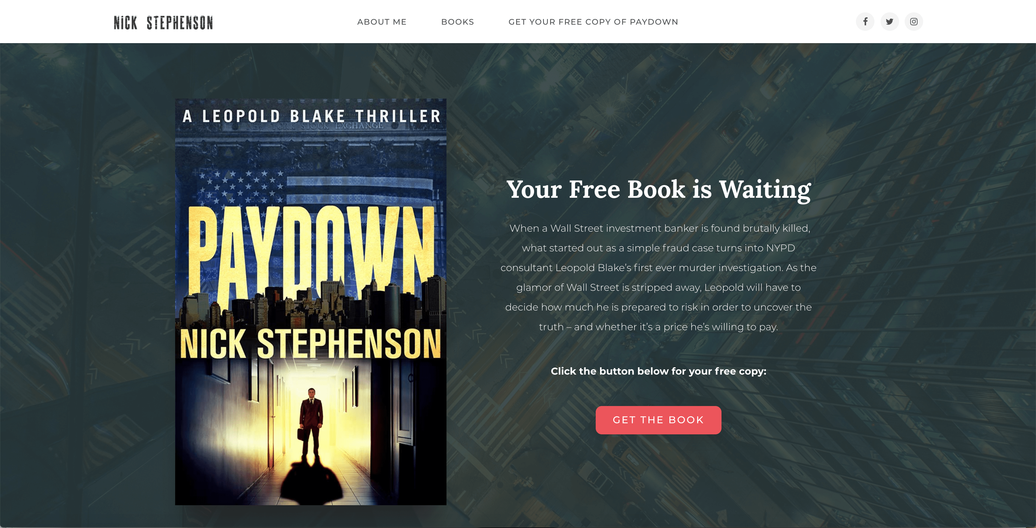
Nick knows his audience, and they are heavy readers. The prospect of a free thriller is going to be exciting to his target market, but not to people outside of it. If he can hook a heavy reader with one thriller, the likelihood that they will purchase the rest of his books is very high.
Offering a free book is a big giveaway, and I especially like that he does not answer a relevant question here – is this a free digital copy, or a free hard copy? Just wanting to get that question answered is enough incentive to get someone to click.
LESSON: Be a little unclear, so users have to click to figure it out
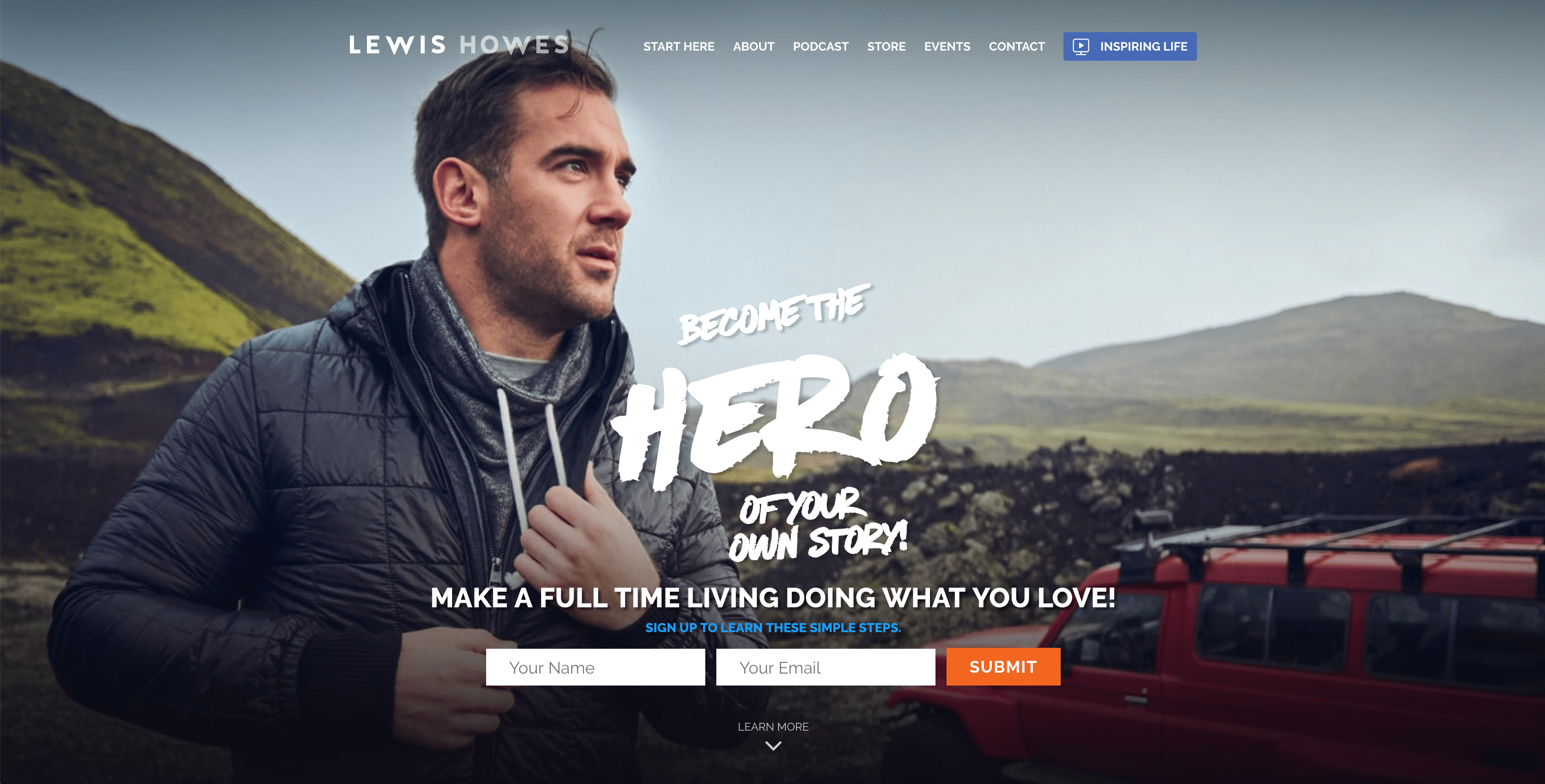
Headline: Make a full-time living doing what you love
At first glance, the headline seems to be ‘Become The Hero Of Your Own Story,’ but I don’t think it is. I think that’s the tagline. The real headline for this homepage, and the message that frames someone’s decision to enter Lews Howes’ sales funnel, is ‘Make A Full Time Living Doing What You Love.’ That is the outcome-based value statement that tells the reader what they are going to get.
The hero shot is excellent quality, and the tagline does more to draw someone in to Lewis’ brand than the headline would. In this instance, I think it’s a smart move to have the tagline overshadow the headline. Without superior design, this wouldn’t work, but this is a good examples of breaking the rules the right way.
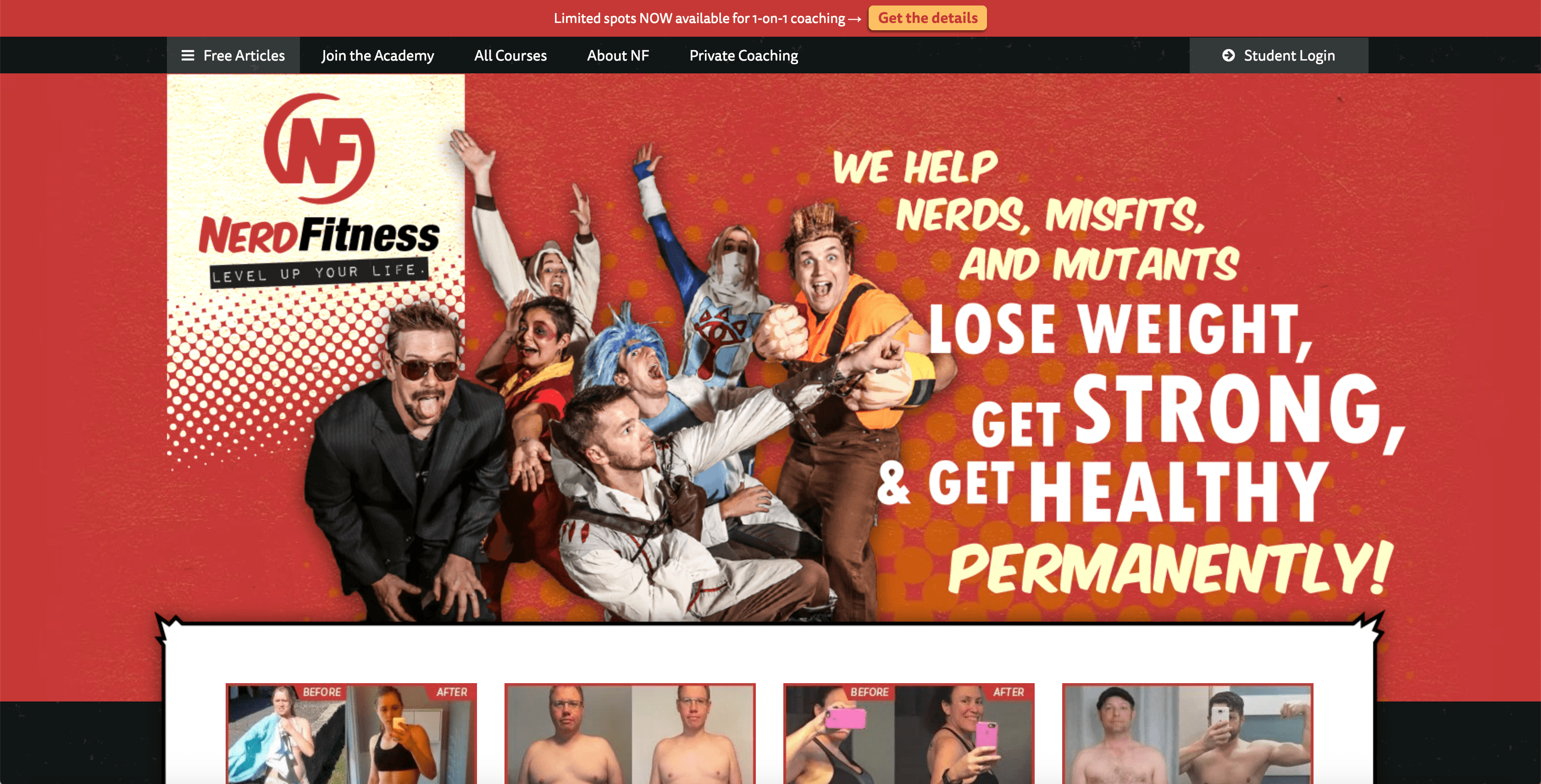
Headline: We help Nerds, Misfits, and Mutants Lose Weight, Get Strong, & get Healthy PERMANENTLY!
There isn’t really a clear CTA on this homepage above the fold, but the messaging is so clear, it deserves an honorable mention. Nerd Fitness, run by Steve Kamb, has a very clear message – so clear, that if you’re a nerd who wants to get in shape, you won’t need a big flashy button for your call-to-action – you’re willing to hunt it down, like the Easter Egg in the bonus level of your favorite video game.
The hero shot is great, the headline is visually compelling, and the before-and-after photos peeking up from below the fold demonstrate the results. Some of the top-level navigation links could technically be CTAs, but without a clear button, or fillable fields, I don’t think this page properly has a CTA – but as I said, it’s so well-targeted, I don’t think it needs one.
So, what do you need on YOUR homepage above the fold?
Contact info – especially important if you’re running an e-commerce store
This is their formula for what to include above the fold on your homepage, and it’s pretty straightforward. However, don’t just follow the rules.
A Contrarian View
Don’t Put Your CTA Above the Fold
It must be noted, putting a call-to-action above the fold is not strictly necessary. As we see above with Nerd Fitness, it’s not essential. There are even some A/B tests that have seen a 20% increase in putting the CTA below the fold.
“If you just rotely put the call-to-action above the fold,” Marketing Experiments says on their blog, “you may be making ‘the ask’ before your potential customer sees the value in why they should act. Or, sometimes, before they even know what you’re asking.”
If you have a solid reason for taking a contrarian position with your homepage CTA – like some of the examples above expertly demonstrates – then do it. Just make sure, as Picasso supposedly said, that you “learn the rules like a professional, so you can break them like an artist.”
That’s why I like website design and sales funnel strategy – there is an art to it, and it’s an art that generates revenue – especially when you know which rules to break.
About The Author
Caelan Huntress is the father of 3 kids, and in his spare time serves as creative director of Stellar Platforms. He is also a writer, digital marketer, multimedia producer, and a retired superhero. He blogs about his adventures on https://caelanhuntress.com.
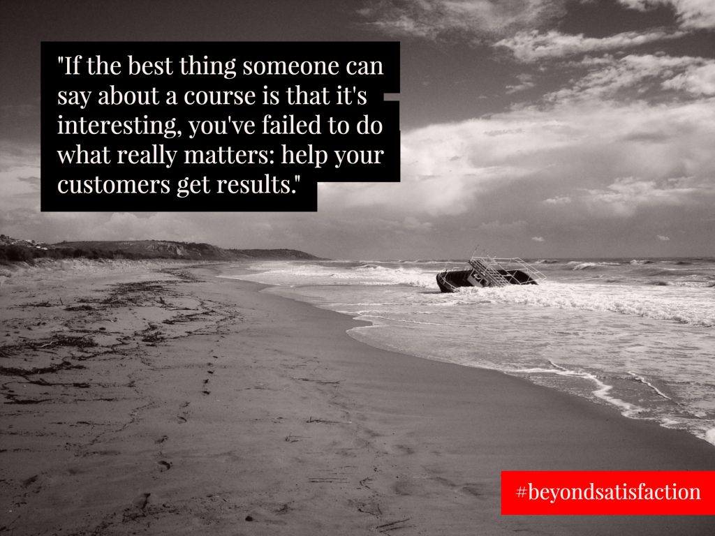
Breanne Dyck has quickly become one of the most highly regarded business and learning strategists in the online marketplace. She’s one of those experts that the “big names” go to when they want to get their business and their online courses to the next level. HerBeyond Satisfaction book launch this week has brought many of those big names out to talk about why her work is so transformative.
Over the past few years, she’s worked with lots of big-name influencers you’d probably recognize (Chris Guillebeau, Natalie Sisson, Tara Gentile to name a few) to help them create courses that aren’t just profitable, but actually change lives. And in this new book, she shows you how to do the same.
The Problem With Online Courses Today
The online course marketplace is getting crowded. Now that publishing is easy, there are many low-quality courses out there, diluting the effectiveness of online education.
Breanne’s Beyond Satisfaction book helps course creators aim higher than average, by designing the course around the transformation that happens to the student.
The Beyond Satisfaction book is not just about crafting a highly profitable online course, program or workshop, but also provides the strategy for how to create an online course withou having to settle for less-than-transformational results. It’s full of case studies, research and case studies about how you can create a course that truly gets results.
Stories of people who have cracked the code on leveraged products that are extraordinarily profitable … and incredibly transformative.
Stories like Tara Gentile. Tara had been offering her flagship group program for years, and it got solid results. But as time went on, Tara found that her customers were less and less willing to buy. They were getting jaded about online courses, and had put themselves on a course buying moratorium. They were afraid that if they did invest, they wouldn’t ever use it.
Despite all of this, Tara was able to adjust and adapt her program so that it’s now selling more easily than ever — and getting better results, too.
If you want to know more about how Tara did it (along with several other great case studies and success stories), you need to read Breanne’s new Beyond Satisfaction book.
Exclusive Interview with Breanne Dyck, author of the Beyond Satisfaction book
Who did you write this book for, specifically?
This book is for the online business owner who is tired of courses, workshops and programs that may look good on the outside, but fail to deliver customer results. Whether they’ve offered courses before or are preparing to offer their first one, they recognize that just “having a course” isn’t enough. Their customers — and their business — deserve better. If you are a course creator who wants to have a massive impact on your students’ lives, this book is your guide to doing that.
What is the most surprising thing about people who make online courses?
It never ceases to amaze me just how little most people think about what they’re actually creating. They’ll think about sales, they’ll think about marketing, they’ll think about what tech to use … but they won’t think about how people learn, and how that impacts what they end up creating. In fact, some are downright dismissive of the idea that there could be a better way to deliver training products and get their customers taking action. That blows my mind — if there was a chance that you could create better results for your students, and thereby your business, wouldn’t you want to take it?
What are your predictions for online education over the next 5 years?
The market is going to get more and more crowded, and as such, more and more jaded. We’re already seeing the start of this, and the results are that many course creators are finding it harder than ever to sell out the very same programs that used to “sell themselves.” So they’re looking for new revenue streams, and new ways to deliver their training: membership sites, masterminds, certification programs, intensives, and more. Plus, let’s not forget the impact of changing technology. The first business to capitalize on virtual and augmented reality in a way that is natural and authentic? Will have a gold mine on their hands.
Who do you really look up that is teaching online courses right now, and why?
The easy answer here is for me to say Tara Gentile, but I feel like that’s somewhat of a cop-out given that I’ve had a hand in crafting those learning experiences. But the people that I really am paying attention to, right now, are the ones who are experimenting with new forms of delivery other than the same old “8-week video course” as well as those who are actually looking to break out of the online-only world and do online/in-person hybrids. I can’t really give you names, because those products aren’t public yet, but be on the lookout for them. They’re coming.
When someone is just starting out with teaching online courses, what is the advice you always give them, that they don’t even think about until they hear it from you?
There’s two things, depending on where they’re at with their business. The first is that an online course shouldn’t be your first product. Unless or until you’ve worked with people one-on-one, you really shouldn’t be rushing into creating a leveraged product. After all, if you can’t find one or two people to sell to now, how on earth are you going to find ten, twenty or more that you can sell to as a group? For those who already have a service or product that they sell and are wanting to turn that into a more leveraged product / learning experience, you need to obey the 80/20 Rule of Curriculum. 80% of your participants’ time should be spent DOING the work, and only 20% consuming content. It’s really contrary to “common sense”, but the less content you include … the more likely your participants are to see success. Provided you’re giving them the right 20% content (and activities), that is!
I am an American expat living in New Zealand, and I have spent ten years running an online business while traveling the world with my young family. I'm a website designer, copywriter, and sales strategist who specializes in creating online courses and sales funnels for bestselling authors, business coaches, and professional public speakers.

![[Book Review] The Thought Leaders Practice](https://stellarplatforms.com/wp-content/uploads/2019/06/Instagram-1080x675.jpeg)


 I am an American expat living in New Zealand, and I have spent ten years running an online business while traveling the world with my young family. I'm a website designer, copywriter, and sales strategist who specializes in creating online courses and sales funnels for bestselling authors, business coaches, and professional public speakers.